** View Article LARGE On Black **


Hard-copy Image cropped slightly different than the original small, online press image in Stephan’s prior report.

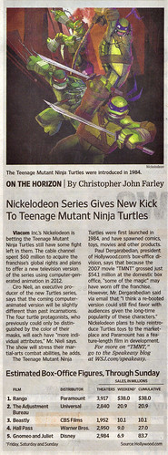
** Original WSJ online article. **

** Scan from verified, paid-for hard copy of the article. Only the TMNT portion of the page is shared within. No infringement implied. Article will be removed at publisher’s request.

Teenage Mutant Ninja Turtles and all related characters ©2011 Viacom International Inc. All Rights Reserved.
Teenage Mutant Ninja Turtles®, including Raphael®, Michelangelo®, Leonardo®, Donatello®, and April O’Neil® are registered trademarks of Viacom International Inc.
Based on characters and comic books created by Peter A. Laird, Kevin B. Eastman, & Mirage Studios.


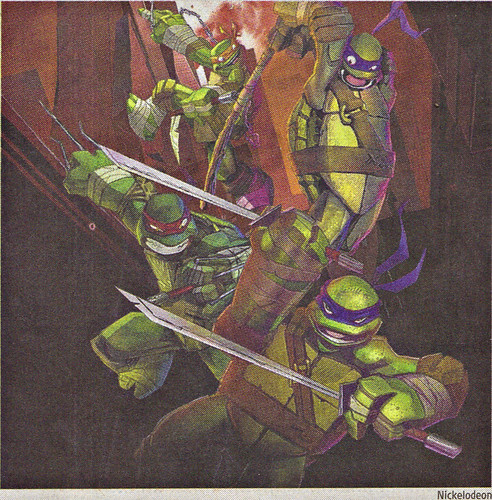
I just realised! Mikey doesn’t have his Chuks! Still love it though.
@Adam – yup, I noticed that too. Not sure how I feel about it yet. If it’s just for the promo pic, it won’t matter obviously. But as a permanent change to Mikey’s weapon of choice, it could still work for the character. Would give him more range and reach in combat. And it’s still “chain-based,” lol.
Other things I noticed:
Hand and feet proportions seem bigger, ala the older designs and concepts. Like real turtles.
Bandaging on the hands and feet, which is great since real boxers and MMA guys all do this. If you fight all the time, it’s pretty much required. I like that the TMNT have adopted this look as well. Suggests a harder slant to this take all over again.
Belts and straps look bigger, more Mirage-esque to me. Again, very nice.
The weapons have a very rustic and worn look and feel to them, like they’ve actually been FIGHTING with them, lol. I loooooove this touch!
The overall look seems to be nodding to the IMAGI style, only a little grittier, without losing the facial touches that make each turtle who they are. Good stuff.
VERY STOKED FOR THIS!!!